Amazon A Plus Content, also known as Enhanced Brand Content (EBC), helps boost sales by up to 10% when optimized.
What is A+ Content? Think of it as an image-rich, premium product description.
And a no-brainer way to get ahead of tough competitors and hijacking imitators, if you ask us! Think of it as an extra opportunity for you to sell your products by providing information that you couldn’t fit in your product images or product features.
Until last year, Amazon A+ Content was previously only accessible through Amazon Vendor Central. Since then, it has evolved from a paid program to becoming completely free for vendors and professional sellers alike.
If you’re not already taking advantage of this extra and free way to increase conversions for your product listings. Keep reading for a comprehensive guide on how to access A+ content features, and insight on smart content strategies. And information on how to create content that shoppers love to increase your sales.
Amazon Brand Registry 2.0 Requirements
Amazon has its own hoops. So.. many… hoops…

First thing first: make sure you qualify for Amazon Brand Registry 2.0.
To upload enhanced brand content, Amazon requires brand owners and authorized brand agents to both have an active registered trademark and be enrolled in the Amazon brand registry program. The “2.0” part of the name isn’t just there for the coolness factor, though. You’ll likely have to apply again if you apply to Amazon’s Brand Registry before March 2018.
Not only will Brand Registry allow you to create A+ Content. But it’ll also grant you access to priceless brand-building features, like storefronts, sponsored brand ads, and handy brand protections that’ll help keep your listings from losing the buy box. Sorry, not sorry, counterfeit sellers 😏
Alternatively, if you haven’t applied for trademark registration, sellers that have a pending trademark through the Amazon IP Accelerator program. Or are in managed selling programs such as Launchpad and Amazon Exclusives, may also be granted access to A+ Content features.
How to Create Amazon A+ Content
If your brand registration and catalog are already approved, you can find the A+ Content editor under the Advertising tab in Seller Central. There, you can create new content or edit existing content.

A+ Content Manager in Seller Central
To begin creating new content, click the blue button on the top right-hand side. On the next page, you’ll see the content details, where you can edit and upload images and copy assets. The logo module and product description text box are preset by Amazon, so you can’t change where those are located. However, you can choose whether or not you use them.
At the very bottom of the content details page, you’ll see an “add module” prompt. Amazon offers 15 presets, called modules, for sellers to choose from. From there, you can create your semi-customizable layouts from the choices. Each module that allows an uploaded image has pre-determined specifications that will need to be followed.

Module choices within the A+ Content Editor
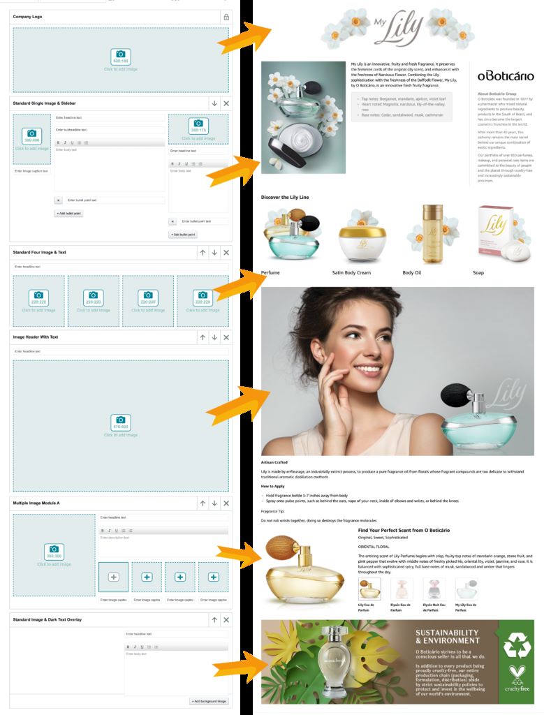
A typical EBC in Seller Central consists of a header with a logo and 5 additional modules (6 total). The layout can be customized according to your content preferences, and the editor allows you to move and remove modules freely.
For you visual learners out there, here’s a draft for a client created by one of our designers. A representation of what an EBC layout looks like from start to finish, if you will. Notice the order of the modules we’ve chosen, how we balance text and high-res images, and how we focus on providing value to the customer through usage tips, sustainability, and product line information.

Our optimization experts recommend exploring layouts that prioritize images over text-heavy modules if possible, to reduce customer intimidation and increase an emotional connection with your brand identity.
After uploading content to each module, you’ll need to apply the related ASINs in the next tab and submit the EBC for review. Amazon will approve or reject your content within 7 days, at which time it will go live or will need to be edited to abide by the rules set by Amazon.
What to Include in A+ Content
As brand owners, no one knows your product more than you do. Here’s where you can take a page from Amazon’s book on customer obsession, and combine it with your top-notch product knowledge.
In your A+ Content, strive to include images and text assets that answer questions like:
- What’s your product’s main unique selling proposition?
- Is there something special about your production process that justifies your higher price?
- Do you have a brand story that customers can relate to?
- What are the benefits of your product over other similar competitors’ products?
- If you’re selling skincare, food, or supplements, does your brand strictly abide by FDA requirements?
- Are the ingredients in your product high quality? Do you have a review that proves it?
- Do you have a product line or additional products that shoppers should buy together?
- Does your brand give back to causes that consumers also find important?

Being transparent about your brand values, brand story, and product capabilities are all ways you can build a relationship with consumers. Doing so keeps them from clicking around competing products and draws them in with benefits that provide more value than product specs.
How to Optimize Copy & Images for Amazon EBC’s
This section is not so much about design advice as it is about SEO advice.
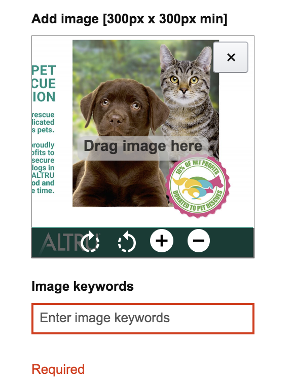
When uploading images to modules, Amazon requires you to enter alt-text descriptions of each image, no matter how big or small they are. You’ll want to incorporate accurate descriptions as well as high-traffic keywords here.

Although text within A+ Content isn’t indexed by Amazon’s algorithm, it is indexed by external search engines like Google. Including alt-text descriptions that are found during keyword research that were not included in the product features section could help you get found on other search engines on the web.
Because Amazon’s algorithm places value on traffic that comes to your listing from outside of Amazon, it’s a win-win situation if you put in the work to include high-res photos and alt-text when choosing and uploading images.
Amazon Premium A++ Content

Creating EBC is free for qualifying brand owners, but in return, it has creative restrictions that require you to build within Amazon’s existing parameters.
You may notice that the appearance of EBCs differs for vendor-sold products, like Apple. That’s because these brands have invested in paid Premium A++ Content in Vendor Central that gives the brand greater creative control, allowing them to upload wider and larger modules, embed product videos, and create scrolling carousels.
Apple’s EBC is beautiful, isn’t it? 😭In true Apple fashion. But with all the restrictions Amazon has for Amazon A+ Content, you’ll never be able to create such elaborate brand story-focused modules, right? Wrong.
Not all of us are raking in enough dough to get Amazon to cut us some slack, but don’t let that discourage you. In our creative perspective, “restricted” doesn’t mean “impossible.” It just means we need to find creative solutions!
Best Uses of Responsive Amazon A+ Content
The A+ content you create will take the space of your text-only product description below the fold, above the product details. However, the placement of it will depend on whether or not your users are shopping on mobile or viewing the product listing on a desktop.
On the desktop, bullets that talk about product benefits are right next to the images, making it one of the first viewable sections that customers consider. When you compare that with Amazon’s mobile view, you’ll see that EBC content appears first, while bullets are below it.
Amazon is the most popular shopping app in the United States, according to Statista, with over 150 million mobile users accessing the Amazon app in September 2019. So while there is a difference in desktop and mobile platform shoppers, you should be creating Amazon A+ Content that looks and reads well on mobile devices. We’ve discovered that the solution that works for our clientele of brand owners and sellers is thinking about how to create responsive Amazon A+ Content. Here’s an example of how to best utilize it.
Everyone Loves a Case Study: Rapid Brands
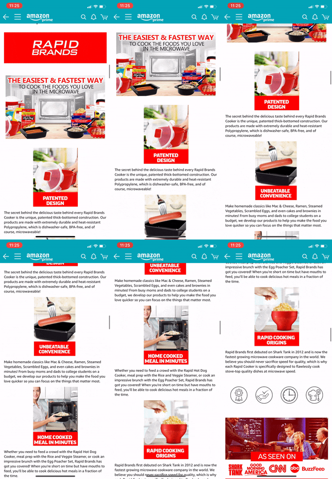
Below, you can see that if you create A+ Content using Amazon’s multi-image modules, it appears differently on mobile than it does on desktop.
Desktop View

Mobile View

Instead of the clean, aesthetically pleasing layout you created, mobile breaks up each picture into its sections. Additionally, because text is often truncated in mobile view, it can mess with the readability of your content if you choose to take advantage of the text modules.
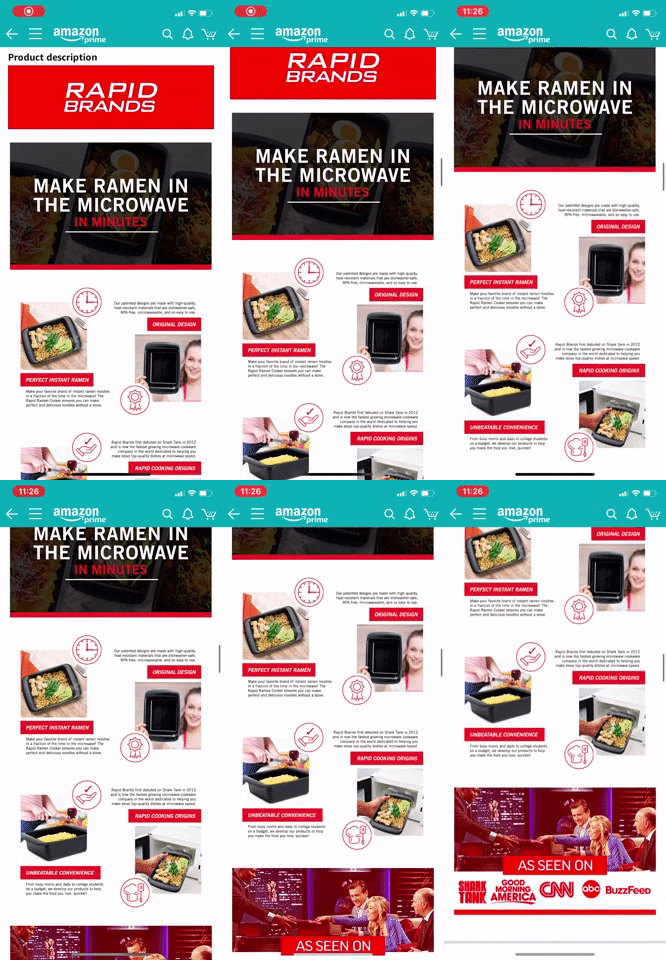
Taking some inspiration from Apple, the experts at Lab 916 sought to create responsive design assets within the limitations of Amazon’s preset modules.
Desktop View

Mobile View

To create an EBC that stretches to fit any screen size, our team of experts simply used a series of “Image header w/ text” modules that allow sellers to upload a 970:600 image (the largest allowed). The results yield cleaner, more consistent branded images that translate across all platforms, deliver the message about product benefits, and give customers an idea of your brand identity.
Because this is a new strategy, and a brand new approach to A+ Content, the experts at Lab 916 have been conducting experiments on which content performs better, and suggest you do too!
A/B Testing for A+ Content
Don’t rely on your design eye. Don’t even take our word for it. Ultimately, you’ll have to find out for yourself what works for your product, your customer, and your brand.
The good news? There’s built-in software to help you narrow it down. Amazon’s new split-testing capabilities allow sellers to test two different versions of A+ Content, for free! It allows you to run experiments over a 4-10 week time period to help you discover which EBC is converting more customers.

The catch? There are a few requirements. Your listing will need to have 2 versions of approved EBCs applied to the ASIN and it’ll need to be a high-traffic listing. If you’re relatively new to selling on Amazon, because this feature is still in beta, chances are you won’t have access to split testing yet.
If you do have access, our experts recommend split-testing A+ Content over a prolonged period. Even after receiving the results of your experiments, you may want to create new experiments that test which specific modules perform best. In this case, brand owners, be sure that you’re making small changes one at a time, and with a control.
Conclusion
At its core, A+ Content exists to help your brand establish deeper connections with your target audience. Customers who are already on your page are interested in what you have to offer, and your only job here is to give them the context to help them make their purchasing decisions.
These days, customers want to know if their favorite brands’ values align with theirs. Remember that you’ll need to get comfortable with visually telling your brand’s story when creating EBCs. Facts that provide value, but emotion powers desire. Connect with customers by talking about your brand’s origin story, production process, or charitable contributions.
In the same vein, you’ll also need to think about what platform shoppers are using to purchase your product. Through what lens are they viewing your brand? Optimizing A+ Content for mobile viewing will not only increase conversions, it’ll help your brand appear more cohesive and trustworthy.
Even after you think you’ve created the best A+ Content, let data lead the way. Just like product thumbnails and SEO-optimized bullets, you’ll need to keep a vigilant eye on industry trends to tell you what’s working and what’s not.
Happy selling!

